Divine Line Tattoo

Role: UX researcher and UI designer (team leader)
Users think the navigation is confusing and would like to see the artwork easier without digging for it.
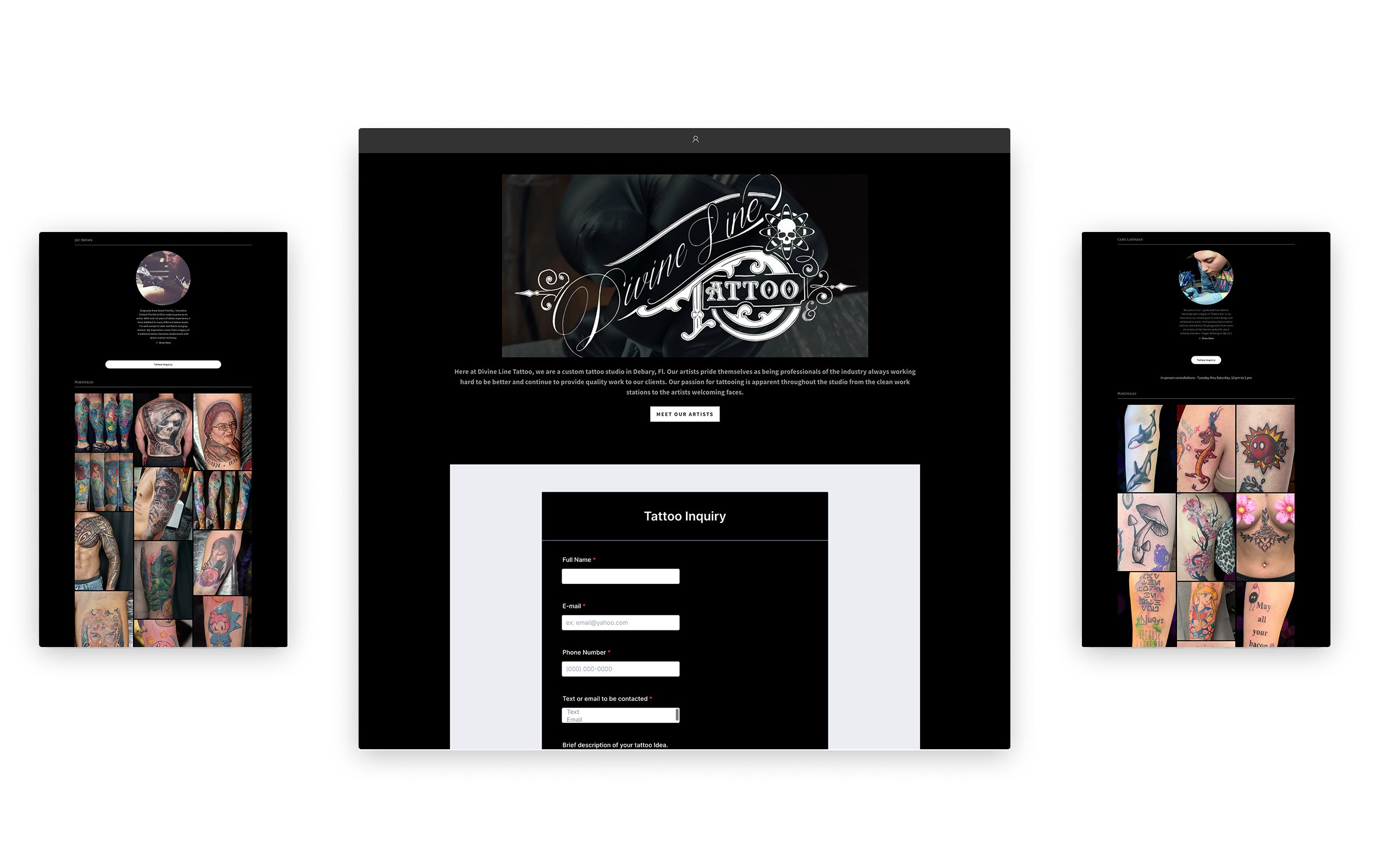
Users were very confused when navigating through the website. The navigation served no purpose for the user. You are presented with a inquiry form at first glance and not a glimpse of the kind of work the artists can do or even show who the artists are so the user can learn more about the tattoo techniques each artist posses.
CURRENT EXPERIENCE

What are the competitors doing and what can we learn from them?
There are two direct local competitors to Divine Line Tattoo but none of them have a website. They both use social media as their way to solely promote their brand. This already puts DLT at an advantage. For other competitors who were outside the local area, only just a few have working websites and what was perceived from their online experience is that they all use black as one their main colors but also use an accent color for CTAs and interactive icons. This helps to break a monochromatic page that may seem un-interesting and dull. They also showcase the artists and gallery of work on the homepage so there is no need to dig through the site to find this kind of information.
Our users and their thought processes.
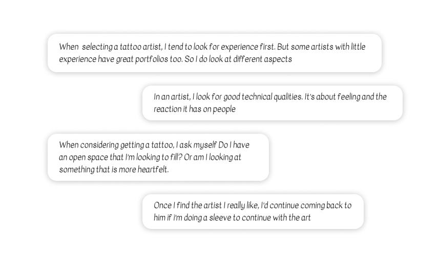
It is always crucial to learn what users need so that the right design decisions are made that will satisfy them as well as the business. From our research we learned that people don’t make quick decisions when selecting a tattoo shop or artist. This is a permanent choice in their body so they shop around until they are 100% sure they found the artist they want to hire and the kind of tattoo they want to get. Being able to see the kind of work an artist can do and what techniques each artist possess is helpful in the decision process for the user.

Users had a hard time navigating the website and had trouble simply looking for what the artists can do.
During the user research, we learned that users want a trustworthy artist with a strong portfolio. Users want to find an artist with their preferred tattoo technique, as well as have amazing creativity that will transform and go beyond the user’s vision into a reality on their skin. Some users would opt to travel to a different city for a professional artist.


Ideal user with all the data collected.
We compiled all the data and created a user persona based on the information obtained. Edgar a 26 year old architect wants to continue his sleeve tattoo and is looking for the right artist who will help him achieve this. He’s been frustrated not locating all the information upfront and would like a straight to the point place to find what he needs.
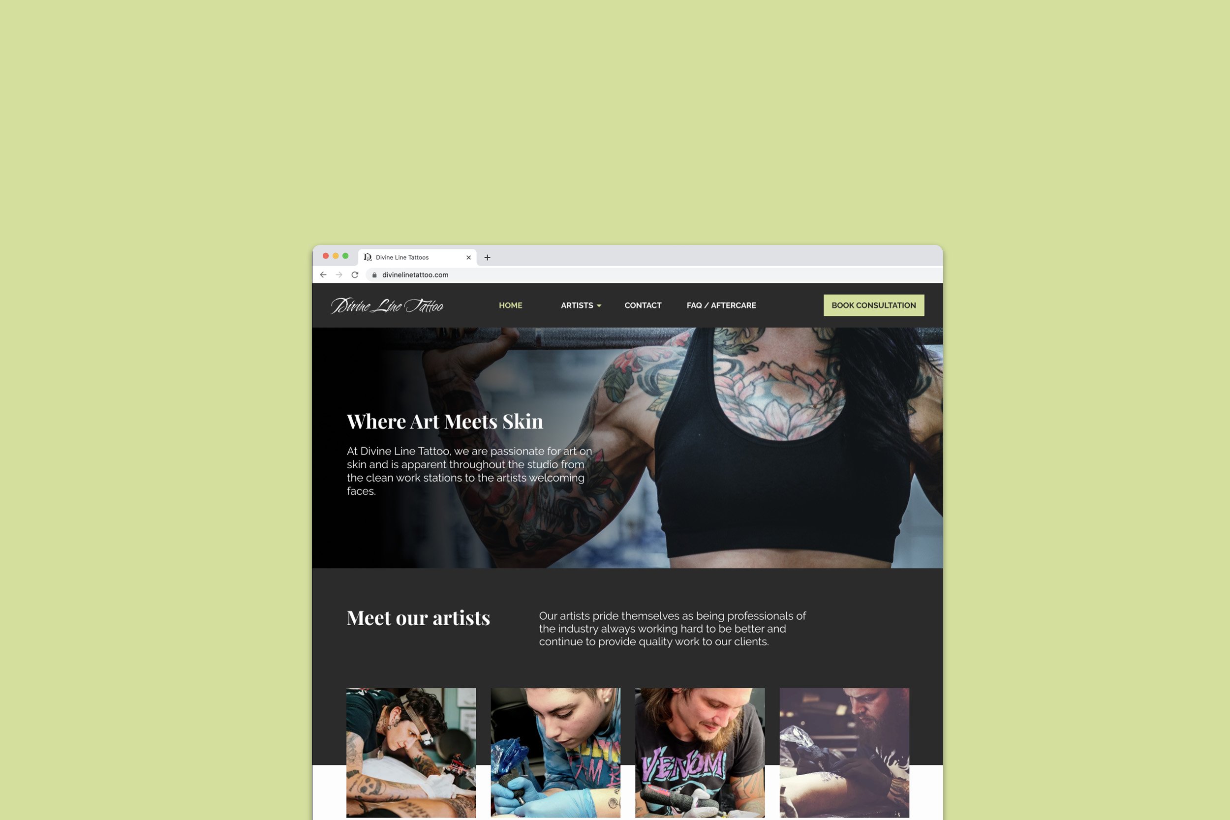
It’s time to elaborate a website that enhances the great work of the artists giving users a quick glimpse of what is provided
We knew the navigation had to be improved from the get-go. Upon testing the current site, we learned that the navigation was confusing users. It had no use whatsoever. There is no way to go back to the homepage unless you hit the back button of your browser. There is also no easy way to navigate so we crafted a new one for a better experience. Users want to be 100% sure they choose the best tattoo artist for them so we knew it was important to highlight the specialization each artist possess on the homepage. Without fluff and lots of digging, users can get the information they need easily.

Navigation organization
We crafted a navigation that linked to important pages of the website. We learned that users wanted to easily obtain information regarding each artist so we decided to add a page dedicated to that, we also added a page for FAQ and aftercare which gives tips to users on how to take care their fresh tattoo. We also added an appointment page.
UI Style Guide
To keep things organized with our components and styles, I created a style guide to help us keep a cohesive look. We

The final look
The experience for this website was completely improved. From the aesthetics to the functionality, the users that tested the site were very pleased with the amount of information offered on the homepage alone. Users appreciated finding the areas each tattoo artist specializes on without digging for that information. We thought it was important to allow the user book a consultation at any time during their time on the website. We did this by adding a button to the main navigation. Users were also pleased with the color scheme chosen for the website. They said it was a great balance with the dark tones you usually see in tattoo websites.
