Academy for Autism

Role: UX researcher and UI designer (team leader)
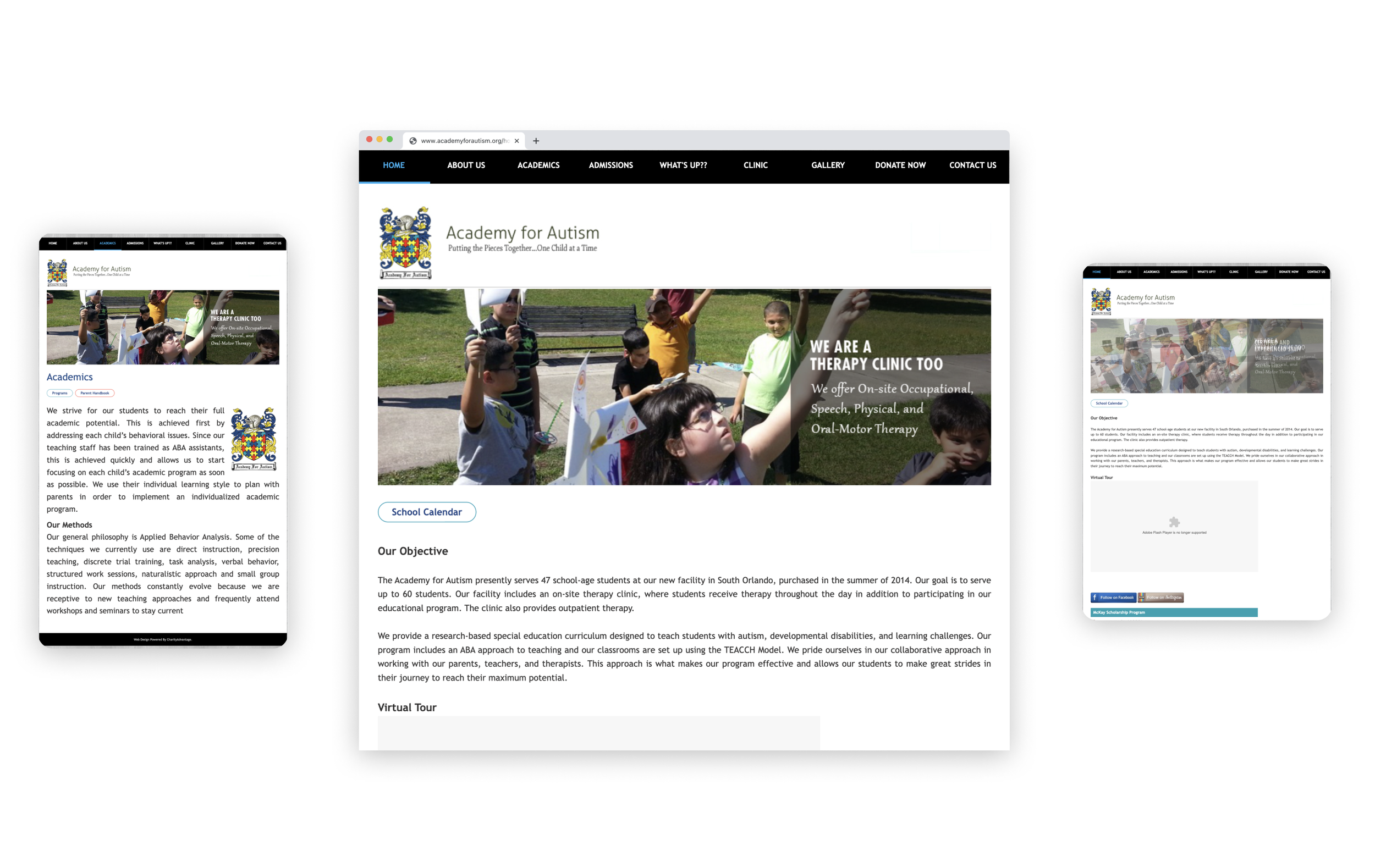
Users are not finding key information on the current website which is also not responsive and not very user friendly.
There were a few very interesting key findings during the research performed for this website. Users find it hard to connect with teachers when that information is not shared at all in the website. Connecting with the school seems frustrating as they have to fill out a form to be called back in a certain amount of time. Additionally, finding a way to donate is not easily to locate. More importantly, not being able to use the website on their phones is really frustrating to them.
CURRENT EXPERIENCE

It was time to start looking at what the competitors were doing.
This step was crucial to provide strategic insights into the features, functions, flows, and solutions competitors have come up with, be inspired by them, and adapt them to fit our product and users.
It was discovered that competitors were very transparent about who their faculty is. It is also very clear how users can support the institutions via volunteering opportunities and donations. The websites are modern and responsive and use great use of white space. They also use a modernized branding and are definitely not afraid of using color in their pages.
It was also found that a few of them leverage their social media channel and incorporate an easy form in their footer to subscribe to their monthly newsletter.

Our users and their thought processes.
It was time to collect data for our user research. We conducted one-on-one interviews to obtain qualitative data about school websites, and special education. We wanted to know the emotions and concerns people have when looking for information on a school website. We also tested the current website and got data on how users behave when browsing through the pages.

Users were confused when trying to locate important details about what the school offers.
During the user testings and interviews, we learned that users want to be able to learn in detail about the school they want to enroll their children at as well as when the children are already attending the school. They want to know who the teachers are and be able to contact them. They also want a website that is easy to follow and it does not require so much digging for simple information.
Ideal user with all the data collected.
Now that emotions and feelings from the data was organized, the user persona was created to describe real life behaviors, goals, needs, values, motivations, frustrations, and challenges. This was important to understand who we were really designing for and empathize with the users.
Let’s create an engaging, informative, and responsive website that provides parents and students valuable information about the school and their services.
This was our real challenge. We knew we had to improve the current user experience of Academy for Autism. The information was lacking hierarchy, responsiveness, organization, and it needed to be more aesthetically pleasing. We wanted to give this website the boost it needed in order to give the parents the confidence that this is a website and a place they can trust for their kids. We knew that by enhancing the amazing features this website is intended to have, we would get amazing outcomes.

Navigation organization
Something that was learned from the user surveys was how confused people were when trying to obtain certain information from the website. To solve this problem, the navigation was revisited and revised
UI Style Guide
A design system was created with patterns and component libraries as well as a color guide on the new colors for the redesign. This helped the team make the correct color combinations.
Re-branding
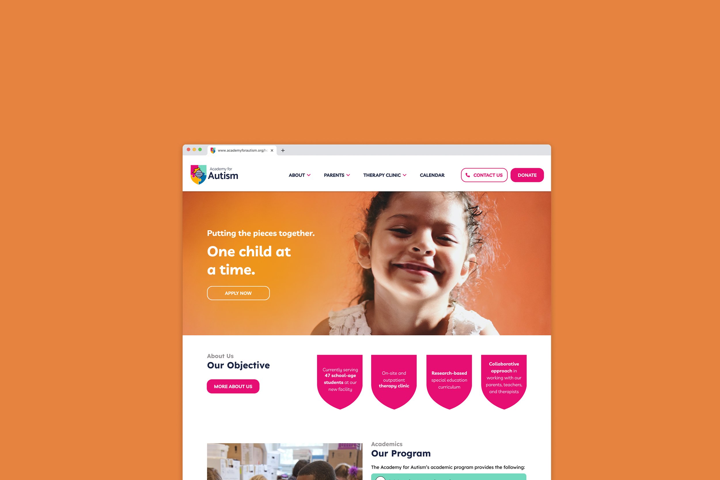
One important aspect of updating the site was giving the branding a lift. I used my graphic design skills to achieve this. Upon doing some research I found the top competitors to use brighter colors and have a modern look. In order to stay competitive and

The final look
Once the prototype was finalized, more user testing was done to confirm users were satisfied with the website and when asked to find certain elements, or perform certain tasks, they did not feel lost or confused. The feedback received was positive. They were happy information about the teachers was provided and was easy to locate. Since this is a school that accepts donations from individuals and organizations, by adding a Donate button, people have the ability to easily make their donation. This was also very well received during our user testing.
