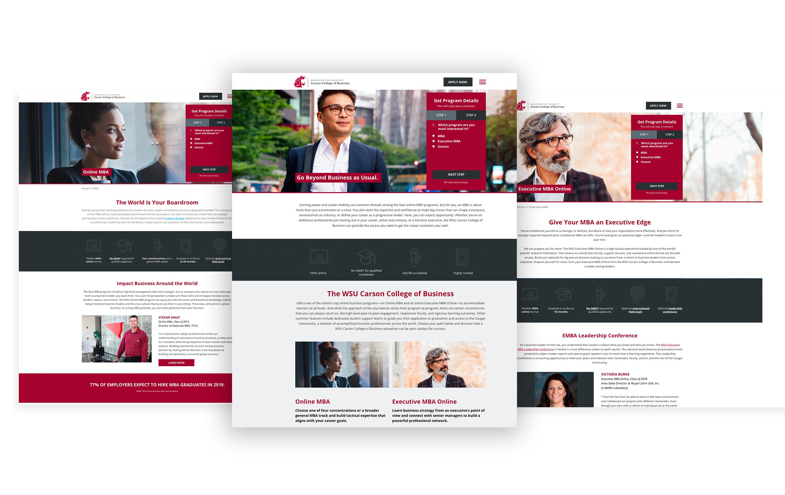
Washington State University - MBA rebranding

Role: UI designer
The main task was to update the entire UI of the WSU page using their new branding .
The Washington State University brand was updated and our site was now outdated. While rebranding site, our team took the initiative and analyzed data received in analytics to know what improvements we could make to the pages along the way. Likewise, we received very valuable data from user interviews. We learned that users feel frustrated when important information such as tuition and costs is not easy to find on the site. We rearranged the sitemap, organized the content better, simplified the pages, added new ones, and worked on the entire experience for better results.
CURRENT EXPERIENCE

Time to begin with the pattern library.
To help the development team, I created a pattern library in Figma which describes the many elements happening on the site. From typography, color, button styles, and components.
Learning about the architecture and UX of the current site so we can improve upon.
I collaborated with different teams (SEO, conversion, development, and copy) to audit and do research on the current experience so we could improve the new website entirely. Once we had established the new sitemap, I was able to begin the design process starting with the navigation. We decided to open up the navigation and no longer have a hamburger menu (except for the mobile experience).
Important changes and additions made in the new experience.
The client requested more “movement” in the webpages. By adding animations in different elements, we were able to provide the partner with a solution that is aesthetically pleasing, plays a great deal in the hierarchy of the page, and elevates the experience. One great example of improvement is the program selector. We want to showcase both the MBA and EMBA programs and the user is able to see a few interactions when selecting the desired program. This helps a great deal with the level of engagement we want from our users leaving them with the desire to click on either option to learn more about it.
One important aspect of the new design was to provide the users with a quick overlook at the programs and how they differentiate. For the client, this was a selling point for them and they know how much the students want to have a clear definition of the programs they are learning about. I designed a chart that is easy to digest with its clear and straight to the point design. The mobile version was a bit challenging at first but with a little bit of testing and research, the right design came to life.
A closer look at the site.
It was important to reduce scrolling on the page as much as we could but still provide enough appropriate information for the users. One important thing done on the homepage besides what was mentioned above, was to introduce accordions on the page. This help the user interact and learn more about the different concentrations offered. The user also has the control to see more of less of the copy in this area. We had studied and tested this option on other initiatives and found that users really seem to interact quite a bit with these options so we wanted to take advantage of this knowledge and put it to work here as well. Something also new to the page is the gallery option on the home page and two more pages on the site. It was important to the client to present the many places the students can travel with the group when they enroll. It’s a great experience and we wanted to highlight this on the page.
